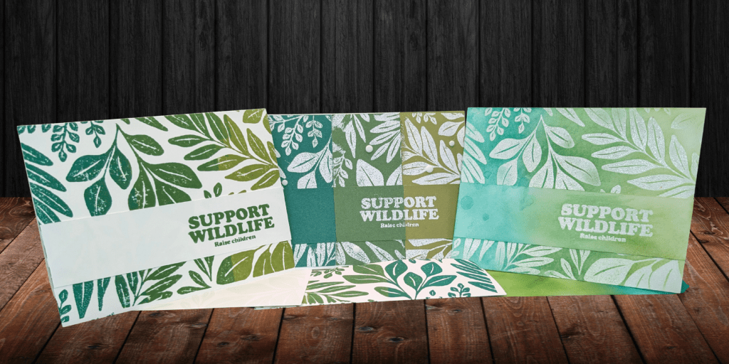

I have a really hard time making simple cards that I like. I usually find them bland or empty, and I struggle to make cards without using patterned paper. But I found the solution to all of my problems: really big stamps.
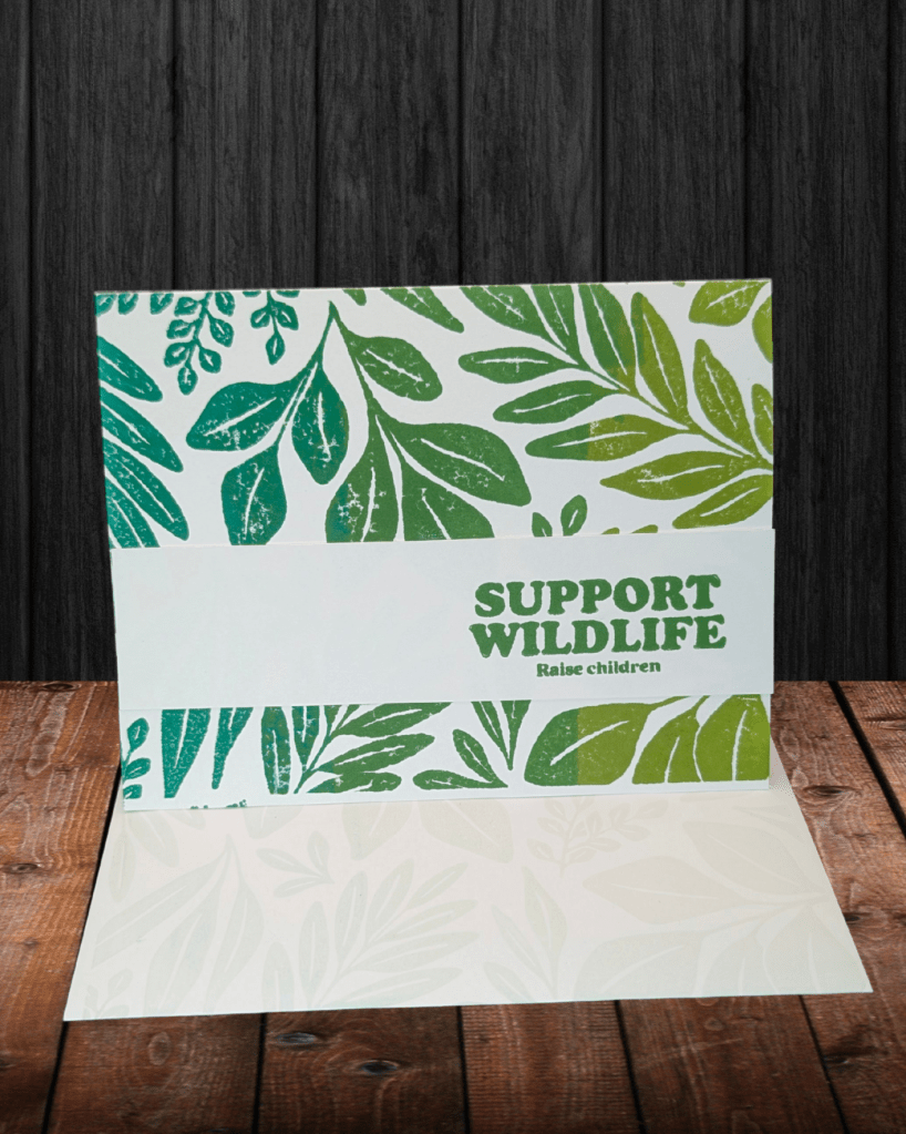
Behold: the simple card. I turned the stamp upside down and used three different stamp pads to put color on. I started with Old Olive, then Garden Green, and finally Shaded Spruce. I didn’t even use sponge daubers. I might next time to eliminate the harshness of the line, but I actually kind of like it. This card used one Big Stamp, one sentiment stamp, three stamp pads, an extra white piece of cardstock, and glue.
Also, I really love the envelopes. This envelope is the result of using versamark after doing the multicolored stamp. I tried to clean the big stamp but didn’t do a great job, and so there’s a slight color gradient in the leaves on the envelope. It’s stunning, honestly.
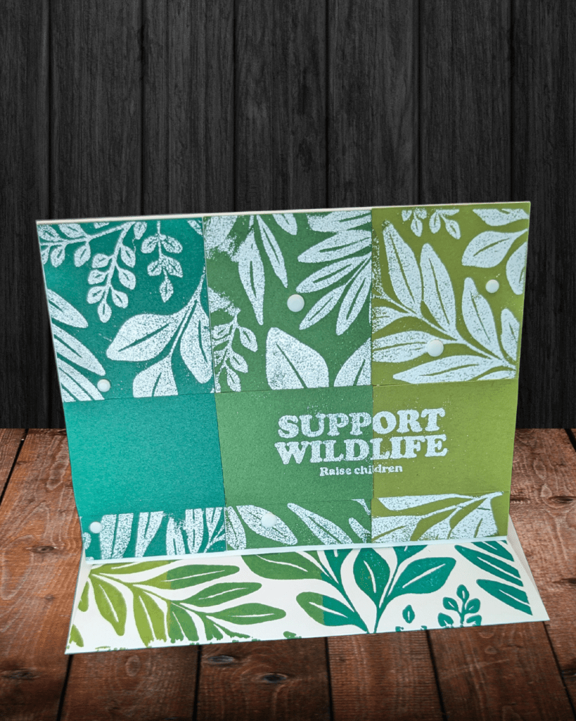
Card #2! I thought it would be neat to do the inverse of the first card, so I used white embossing powder to make a white image on a colored background. The trickiest part was getting the three pieces to sit next to each other when I stamped it, because I wanted the three pieces to touch each other and I wanted the pieces to fit together. That was kind of a waste of effort because I ended up inverting the middle piece and I think it looks great! I just need to practice my embossing skills.
Envelope #2 is the same technique as Card #1 on the top flap of the envelope. I put a piece of scrap paper up against the flap on the front and stamped it right on there.
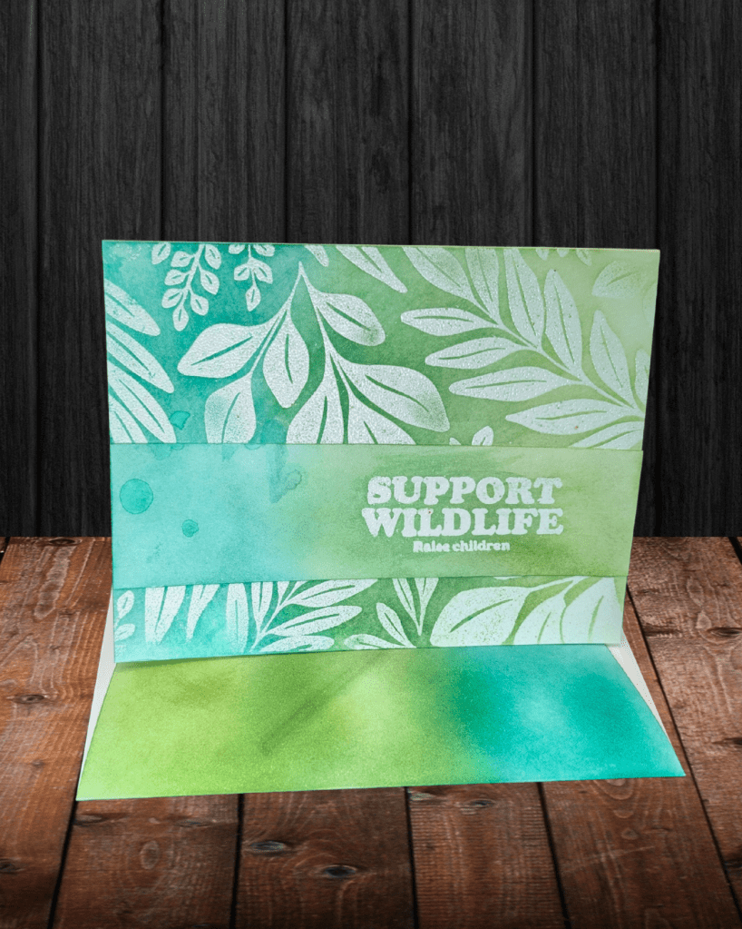
Card #3 involves embossing and blending brushes! I embossed the image in clear embossing powder on white cardstock and then used blending brushes to add the color. I think this might also look neat with watercolors. I used a wet napkin to lightly dab at the embossed pieces after I had blended it to help it stand out more, but I think it looks neat with a little color on it. (That’s why there are a few water spots on the sentiment strip.) I think this one embossed better, but there were weird colored flecks in my powder or something, which is a bummer. I liked this technique though and hope I remember to use my clear powder more.
Envelope #3 used blending brushes to add the colors to the back flap. I think it looks really pretty.
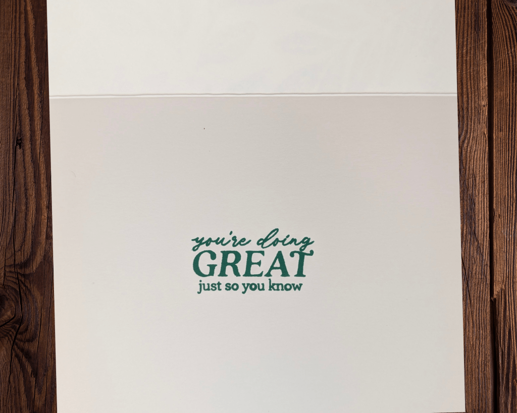
Each card had this sentiment on the inside. It’s a bit late in the year for parenting cards, but I can think of a few new parents who would probably appreciate the pick-me-up anytime.
Also, I didn’t have to stamp these twice. I thought I would need to get out a tool to restamp the image, but I couldn’t find mine so I just went for it, and they all worked out! I tried really hard to put a lot of pressure on the center of the stamp, which might have helped.
I can make my own patterned paper in whatever color I want! I made three different cards that use increasingly complicated techniques and I actually like the simplest one the best. What do you think?
Make sure you check out what my mom made! Her cards are super cute and you’re going to love the paper she uses.
Happy crafting!

One response to “ISS Blog Hop – Step It Up 2025”
Those cards are all great, and make me want to purchase a few more BIG stamps! I love hearing the process you go through when making your cards.
I think I like the third one best, just because of the colors, and the waterdrops!
And I really love that envelope flap stamped in Versamark!! Going to try that.
Thanks for hopping with your mom!
LikeLike