I’m so excited to be a part of the Inspire Create Share Blog Hop! This month we want to introduce the new in colors! They are so bright and fun and full of energy–I’ve been using them in a ton of projects lately.
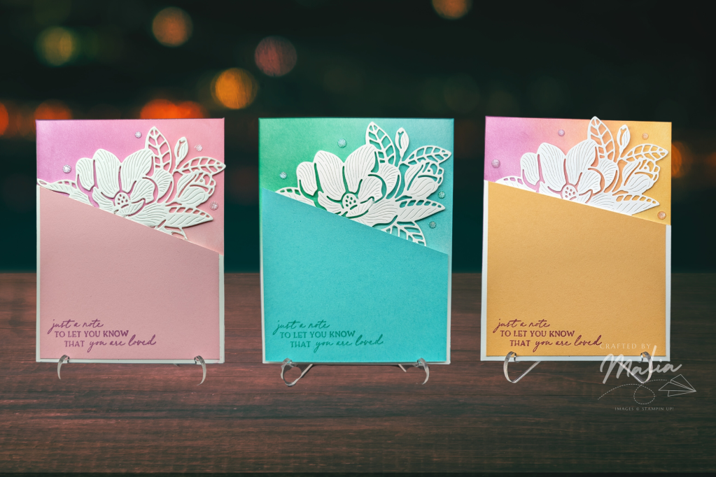
I ended up making a few different versions of this card, not just in colors but also in style. I definitely made it harder than I needed it to be, at least for most of them, but I think they came out beautifully.
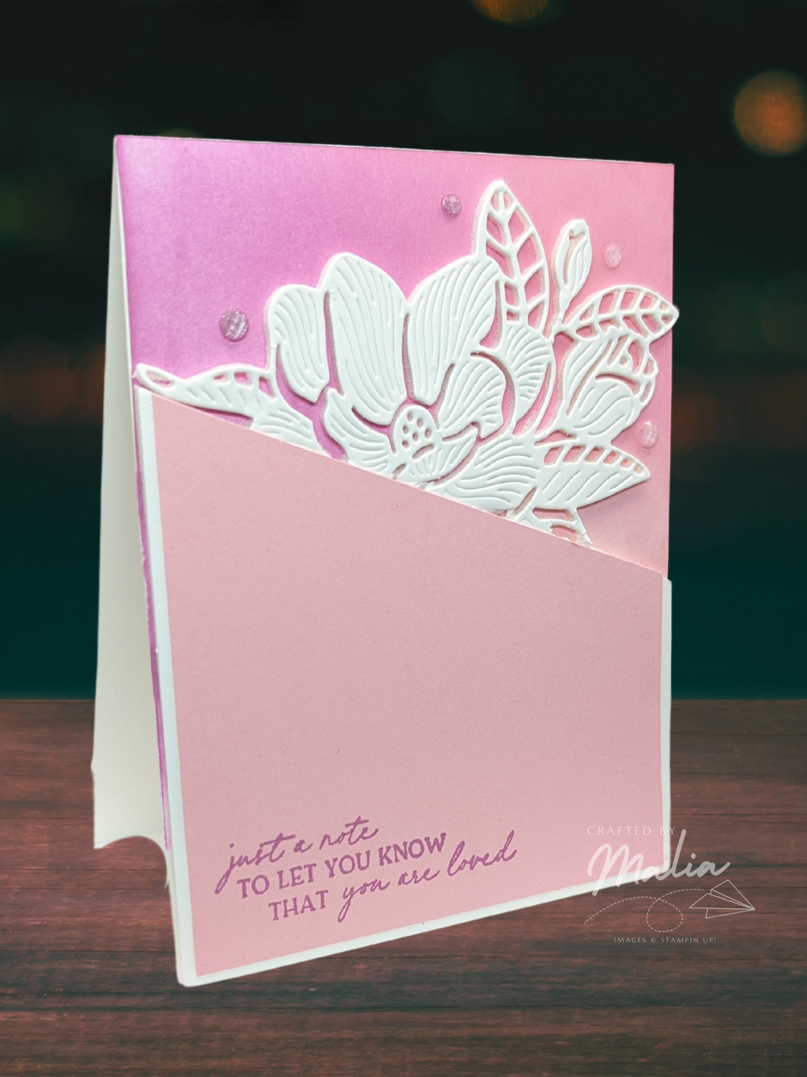
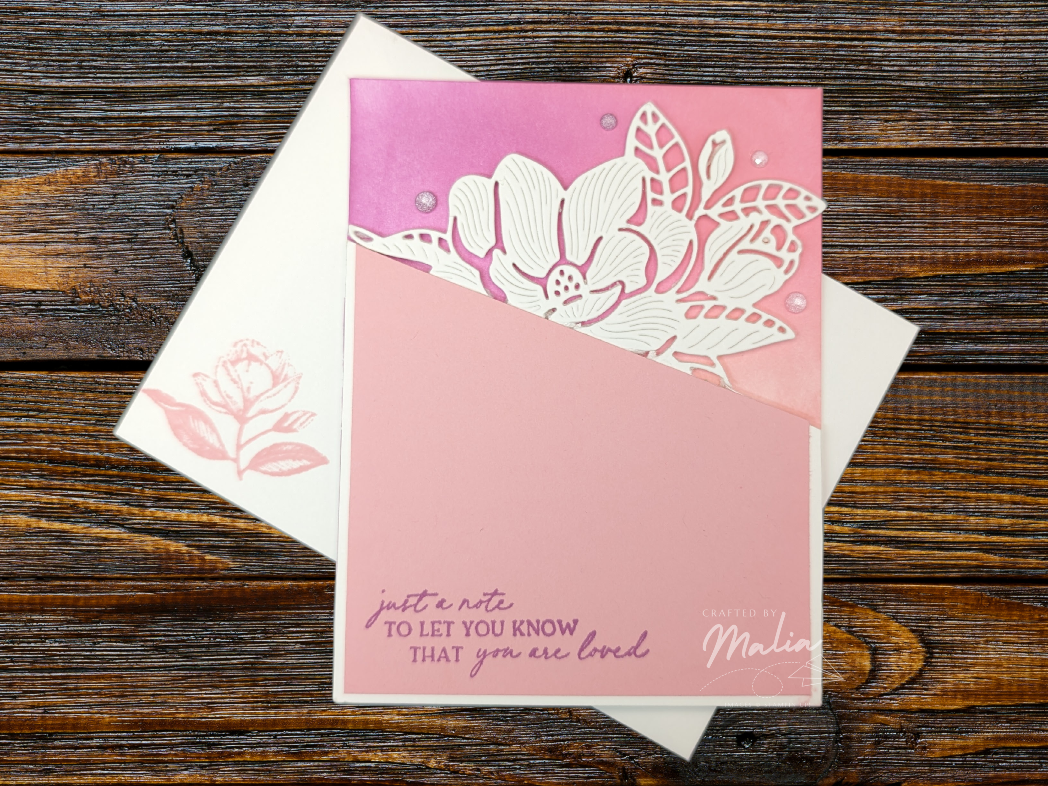
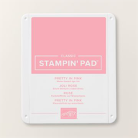
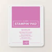
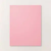
I started with this Pretty in Pink/Petunia Pop card. I’d been wanting to practice a technique where you use a die cut but don’t cut the entire image. In this case, it would look like the magnolia was emerging from the paper (as you see later on). I also wanted it to be popped up, to give it that extra dimension.
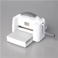
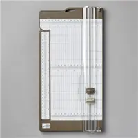
So I adhered a foam adhesive sheet to a piece of basic white paper and ran it through my Stampin’ Cut & Emboss Machine, making sure that the top plate only covered the part of the image I had to cut out. (I also had to angle the piece in the machine so it would cut at an angle.) It actually turned out really well, but then I had a sticky foam piece with a bunch of small pieces that I needed to pry out so that it would look good. It was worth it… for one card, no more.
Tip: This die has given me some trouble in the past. I recommend using a shim with it.
The edge near the diagonal slant didn’t come out perfectly. I had to use a blade to cut some of the pieces out, and they turned out a little messy. I had intended to place a piece of cardstock that had a border all the way around the edge, but I wanted to hide that edge, so it lines up with the edge of the Basic White paper.
Ultimately, this means that for this card I could have cut out the image without worrying about only cutting part of it on a diagonal and then I could have glued it to the cardstock overlay. Oh, well. I got to practice using my die cutting machine in clever ways.
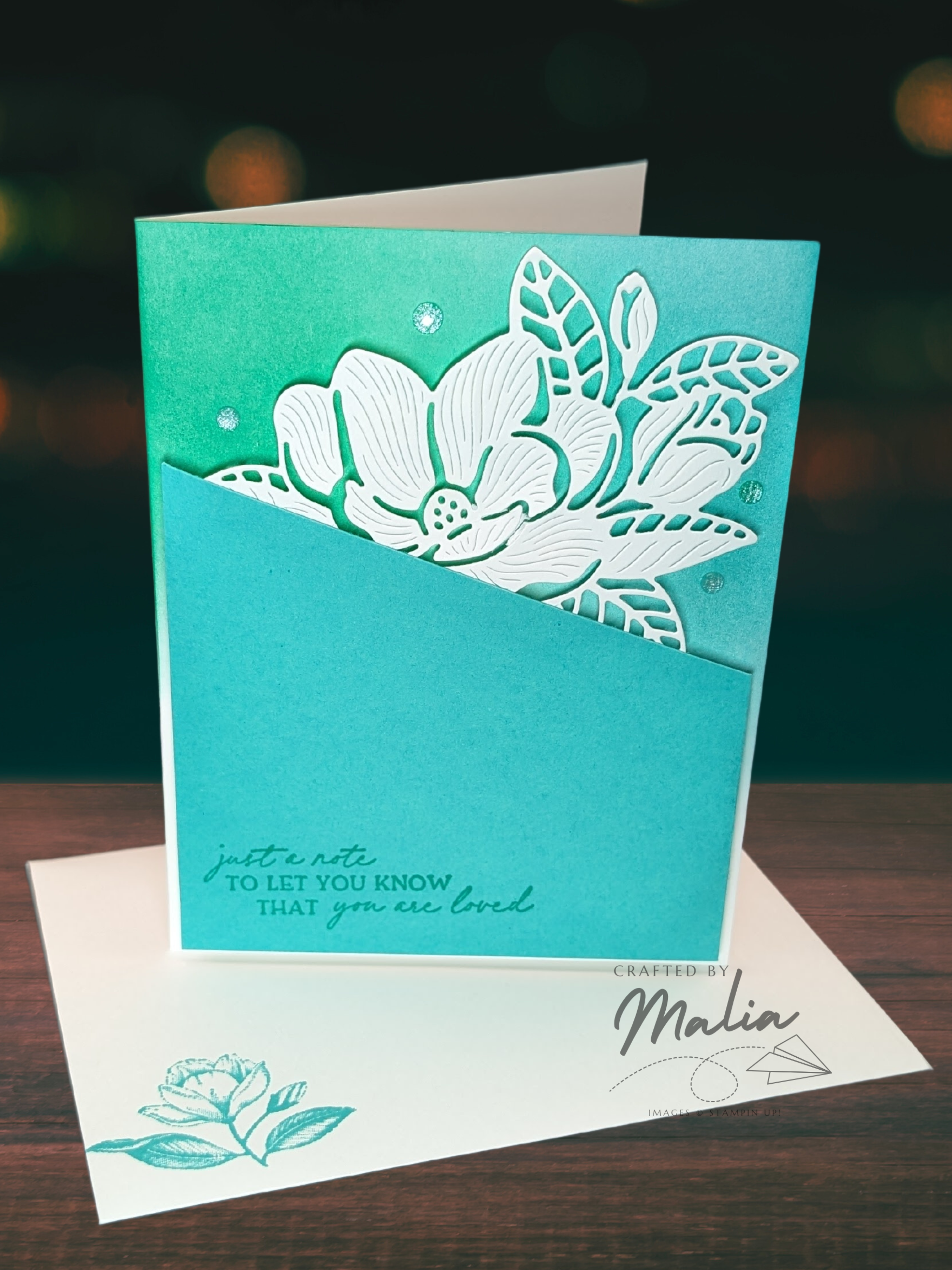
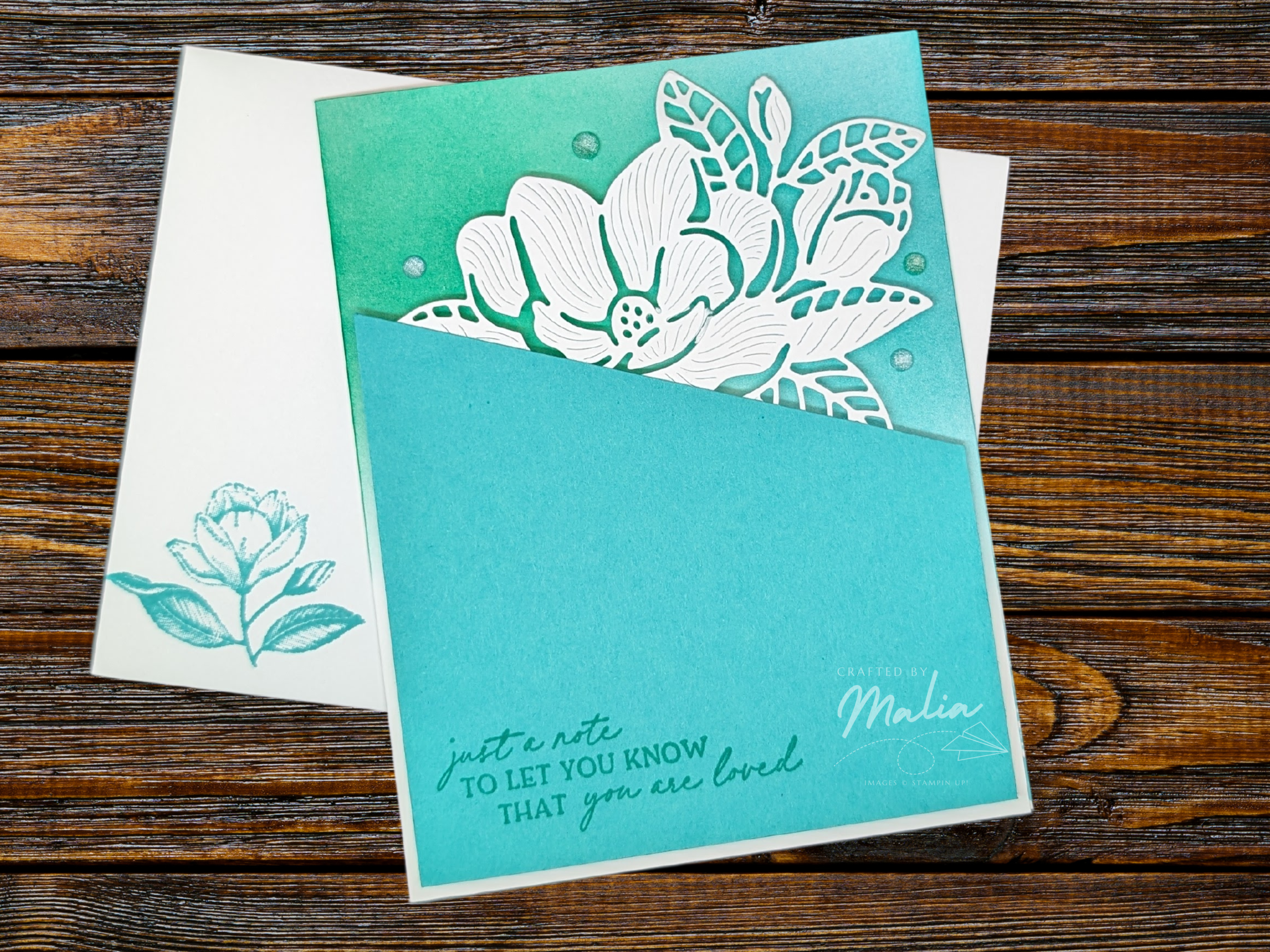
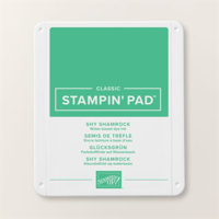
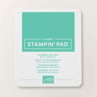
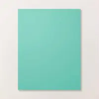
I liked the look of it so much that I wanted to see how it looked in other colors. I decided to try Summer Splash and Shy Shamrock, but make it a little easier for myself. Instead of using the adhesive die sheet, I used some dimensionals and foam adhesive strips to pop this front up. It wasn’t as sturdy or quite as nice as the first one, but poking out the pieces was a lot easier when they weren’t also sticky. Nevertheless, I think it came out really well. The colors are so pretty and this bundle is so elegant. I also got to play with blending brushes, which are some of my favorite tools to use.
My mom had an idea to make this into a pocket card, and so I decided to try and make one more version.
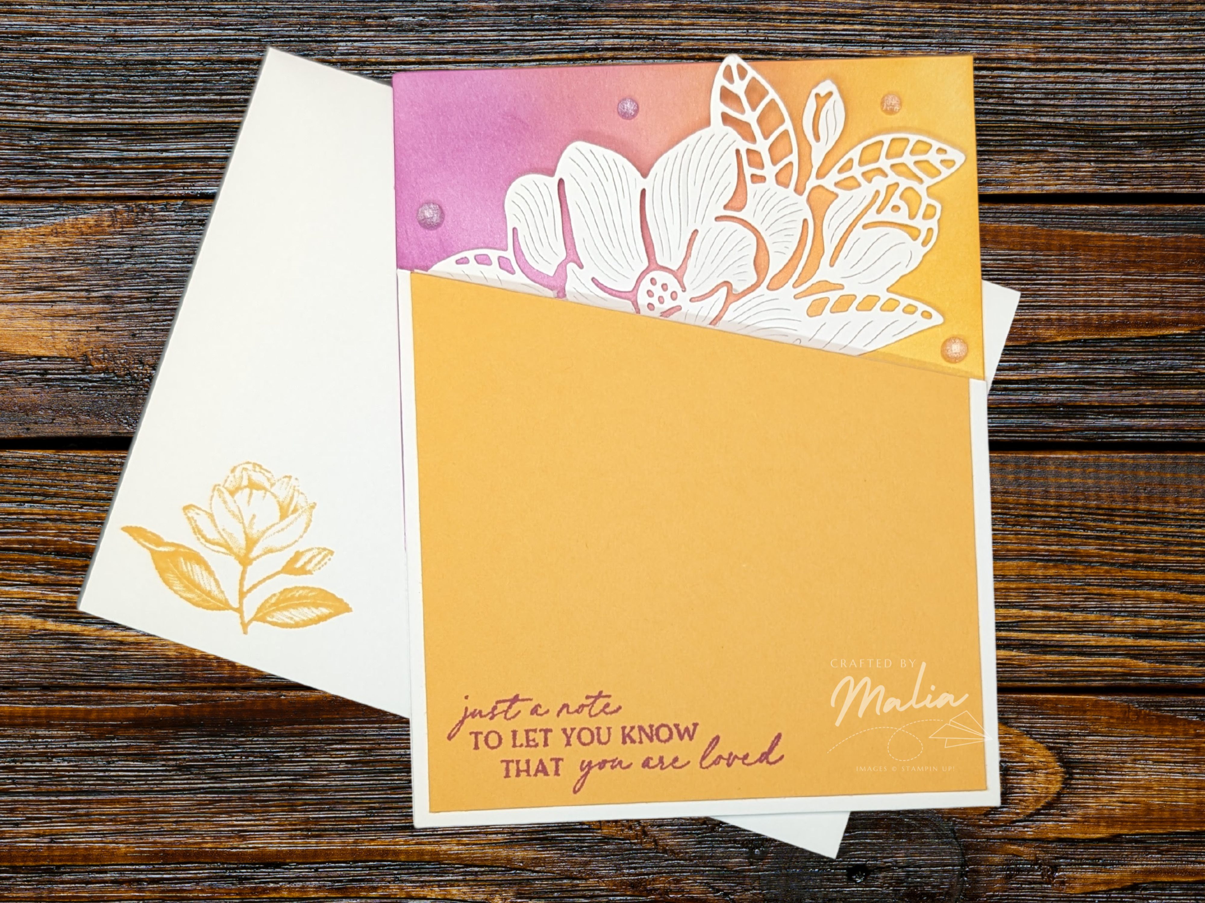
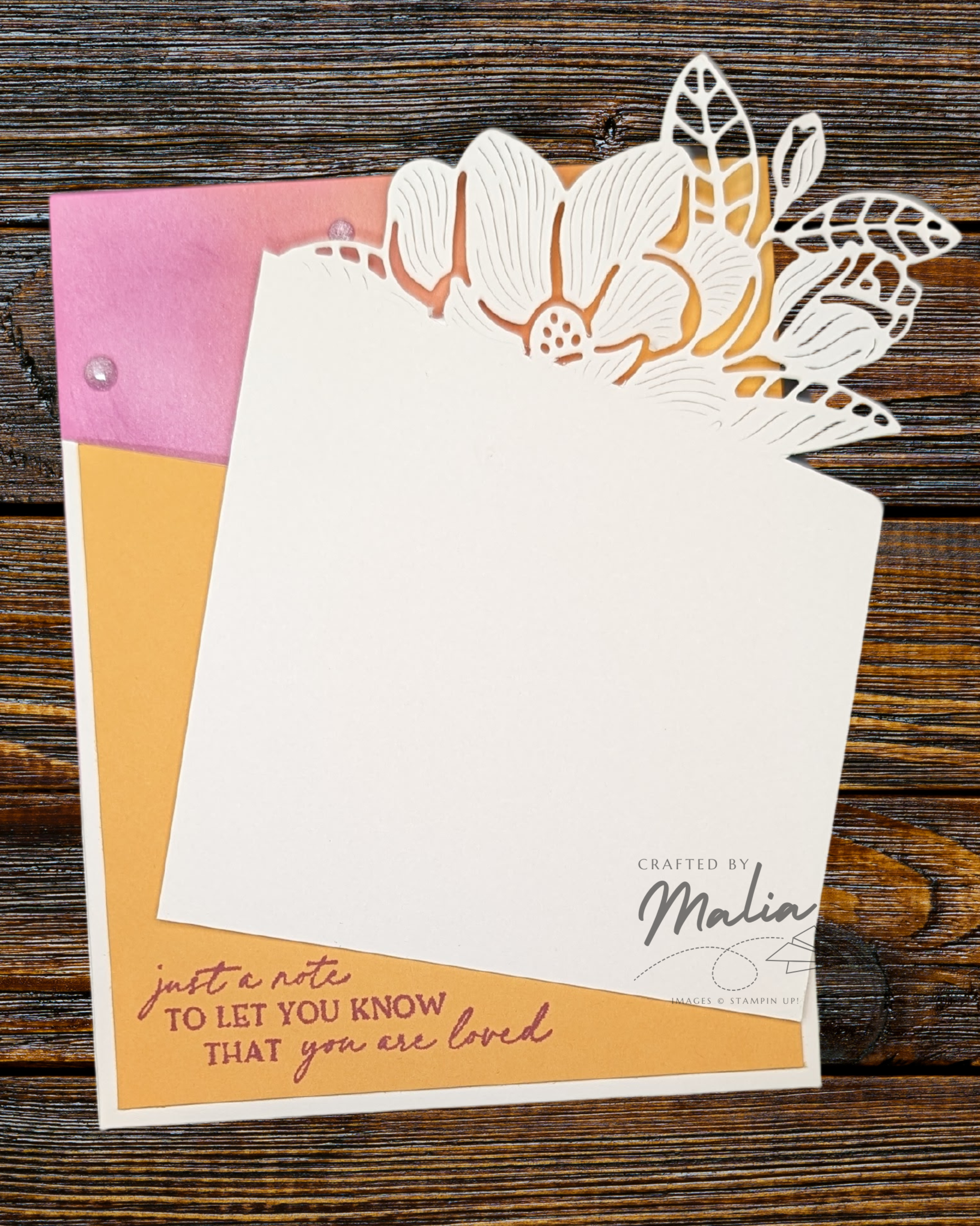
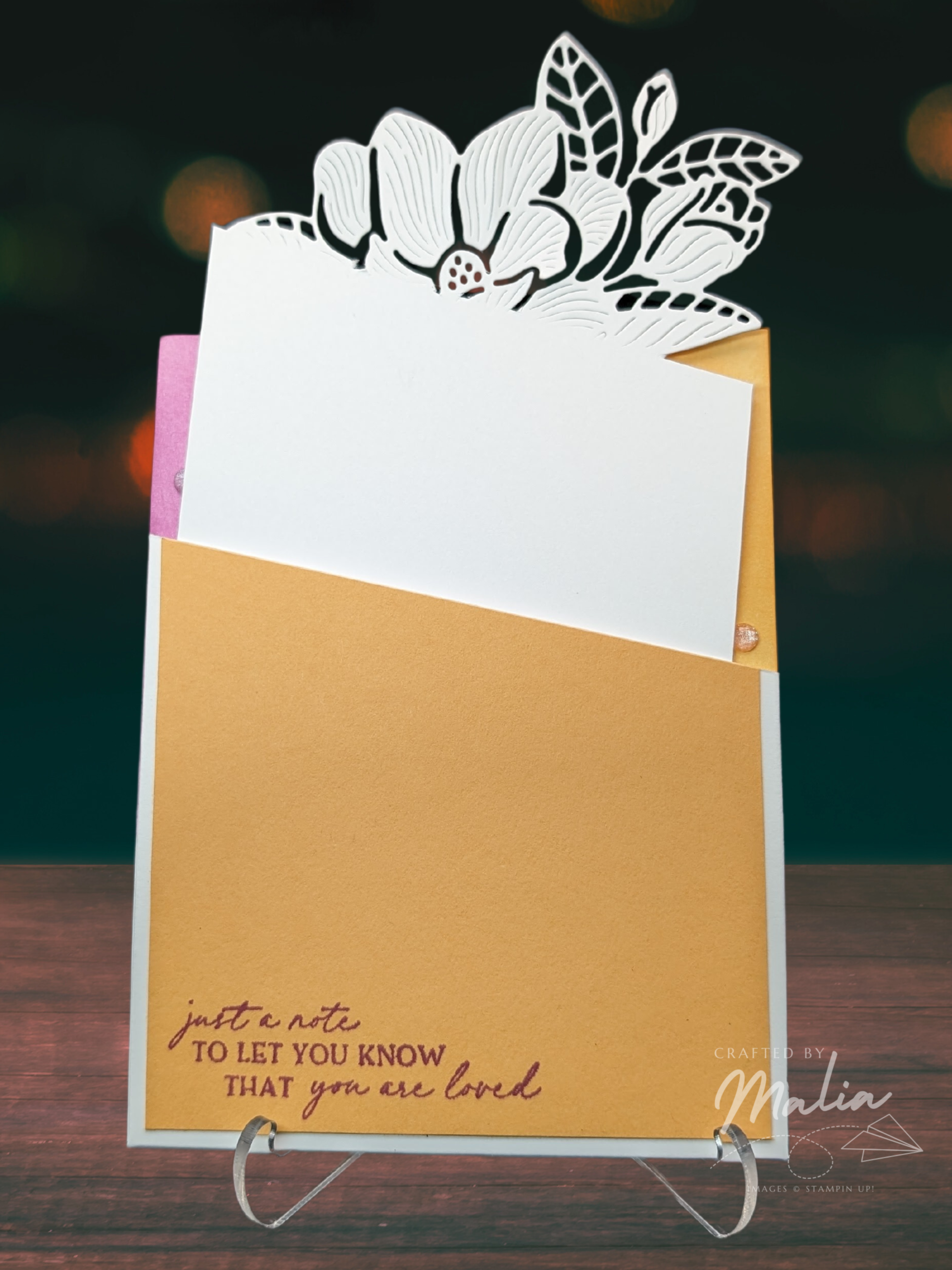
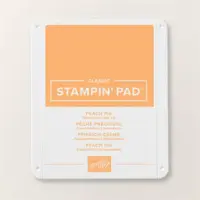
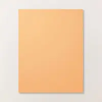
If I’m honest, this is my favorite color combination. The Peach Pie and Petunia Pop come together like a beautiful sunset. This card also made practicing with my die cutting machine pay off. I think the edge came out rather well! This is the flimsiest flower, and it’s a little delicate when taking it in or out of the card, but It’s so pretty and a fun surprise.
Which card is your favorite? Would you try one of these techniques?
I’m really excited to see what the other creators have made! Next, please check out a project by Tricia Butts! I’m excited to see what colors she uses.
Happy crafting!

These are the products I used to make this card:


Leave a comment