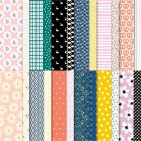
You know, it’s hard to admit, but in any DSP set, there are usually one or two patterns that I don’t really like. Sometimes the design just doesn’t pop, and sometimes I don’t like the color combination. So it’s very rare that every one of the 12 patterns will be a hit, and even more unlikely that 24 would all be delightful.
That’s why Delightfully Eclectic DSP is one of my absolute favorites.
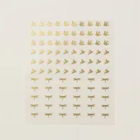
The designs are simple but unexpected in both color choice and design. Who needs a page full of pretzels? I don’t know, but it’s a really cute page. And swans are cute, but what are you ever going to use a mostly black DSP for?
Well, do I have the solution for you.


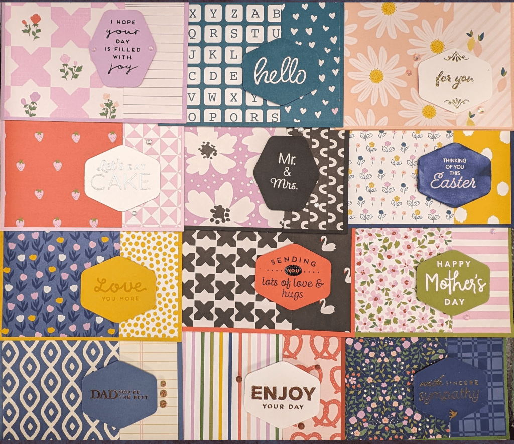
I wanted to make a simple card highlighting some of the patterns in this DSP set, but when I went to choose the designs I wanted to use, I couldn’t decide! So I decided to use them all.
I realized that not only are all of the designs cute, the backs and fronts of each page coordinate really well, so I figured I would eliminate some of the decision making and use the back and front of one sheet on each card.
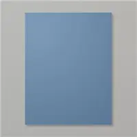
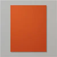
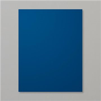
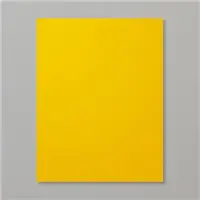
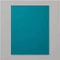
That meant I was going to make 12 cards. I realized I needed cardstock bases and felt overwhelmed at trying to decide which colors would be best. I decided to pull every color that coordinated with the set so that I could hold them up against the DSP pieces. I looked on the back of the DSP set and pulled every color listed. I then had a wild realization–there were twelve colors.
It was fate. Twelve colors for twelve cards. I decided to challenge myself and use each color as a card background.
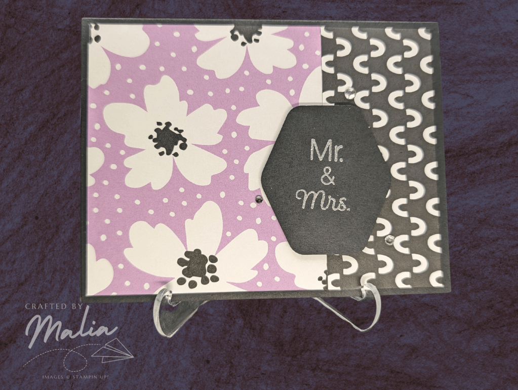
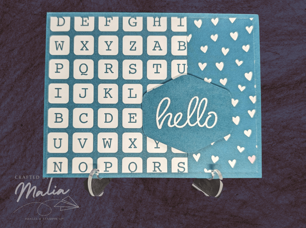
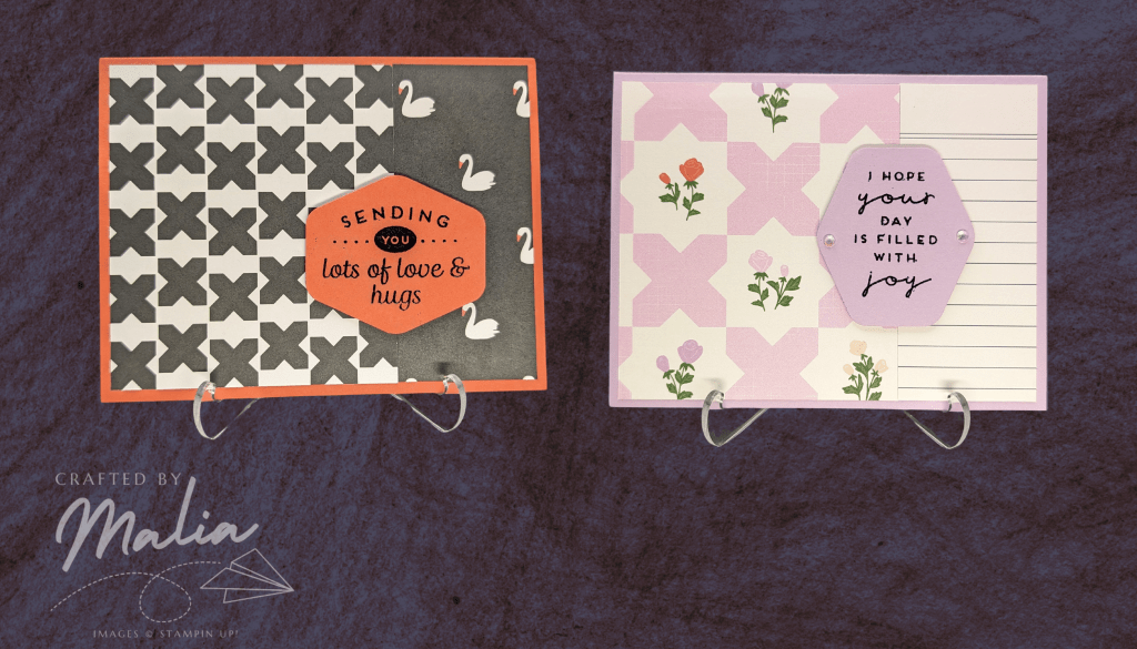
It took awhile to pair them all up. Some matches were surprisingly easy–I paired up the swans with Calypso Coral almost immediately. Others kept swapping around and around–deciding what to pair with Garden Green and Old Olive were the trickiest, and I also held out pairing the alphabet set until the very end, because I was worried putting it on a Pretty Peacock base would be too one-dimensional, but I think it worked out in the end.

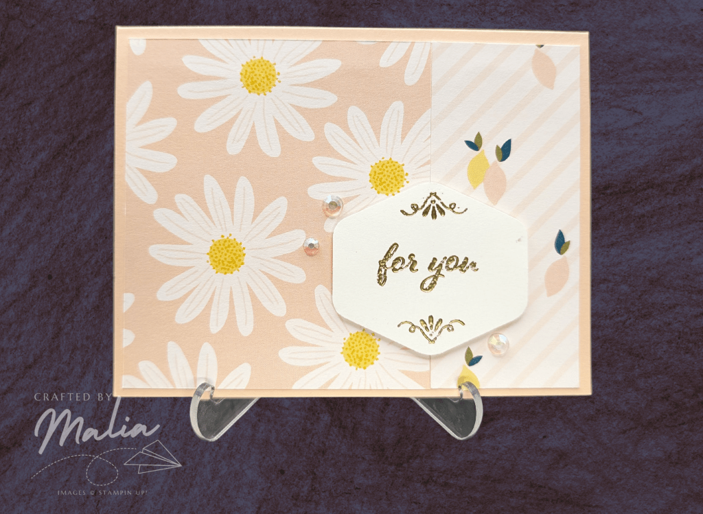
By this point, I was exhausted. I had spent 40 minutes cutting out all the paper and pairing all of the designs, and I had only determined the background of each card. I decided I would make these relatively simple and let the DSP do most of the work for the card. But I knew I needed at least a sentiment.
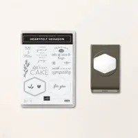
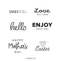
I started digging through my stamp sets to find the best sentiments. Would I just do the same one for all of them? Would I use a few from several sets? As I was looking at some of my favorites, the Hexagon sets, I realized that there were twelve sentiments across both sets.
It was fate.
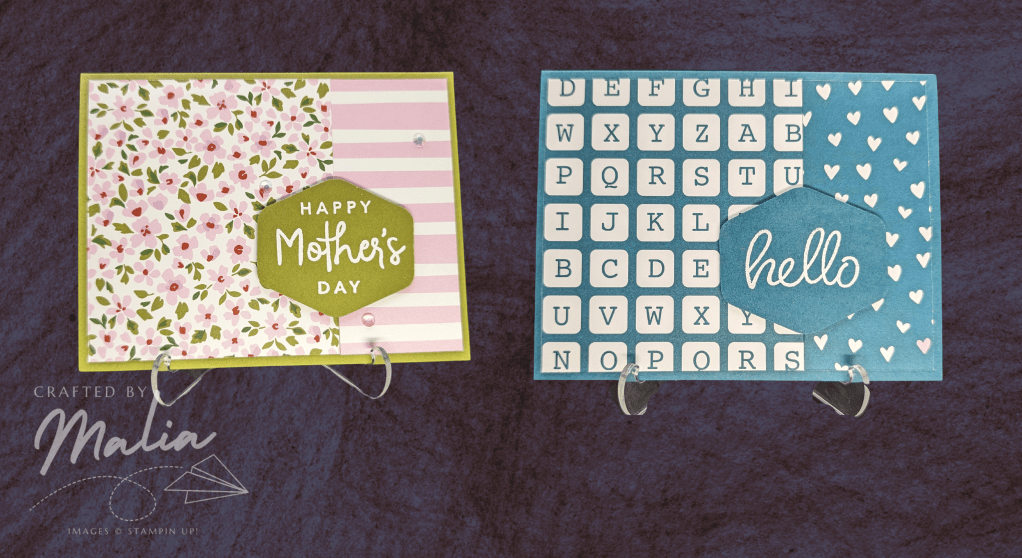
Pairing up the sentiments with the papers was not too difficult. I mostly went by a gut feeling. The Misty Moonlight diamonds and lined paper was the most masculine, so that got the Dad sentiment. I knew the Mother’s Day sentiment should go with flowers, and luckily there were many delightful options.
I was nearing the end of my stamina by this point. My eyes were strained, my forehead was starting to sweat, but I knew that if I walked off now I might not come back to this project for days. These were supposed to be simple cards, so I was almost done, right?
Well, wrong, but I’ll get to that.
I needed to pick the papers to stamp the sentiments on. I went with my gut here, if the background cardstock coordinated well, I went with it, but i didn’t hesitate picking Basic White when it felt right. I ended up punching out a few more hexagons than I needed in case I changed my mind about the cardstock color after seeing the sentiment.
I was feeling relieved and ready to assemble the cards when I realized that I hadn’t stamped the sentiments yet.
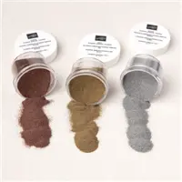
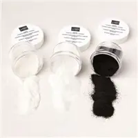
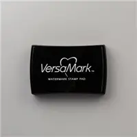
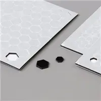
Here’s where I decided to make this project even harder. (Note: if you’ve come for a simple card, just grab some ink pads and go to town instead of foraying into the world of heat embossing.) I had been toying with the idea of embossing some of the sentiments in white to make them pop on darker backgrounds. I got out my heat embossing tools and realized that I had six different embossing powders–so I could do two sentiments in each powder to equal twelve sentiments.

Matching embossing powders made me actually switch some of the cardstock colors. Pairing up the gold was strangely the most difficult, but I got them all settled in the end. I was excited but nervous–heat embossing can be tricky and I had never used clear embossing powder before, but I wanted to give it a shot.
Embossing went fairly well. I don’t know why, but the gold ones didn’t turn out as well as I’d like. Some of the Versamark must have smudged or I must have stamped them sloppily, because they didn’t turn out as neatly as the others (I even did the For You one several times and picked the best one).
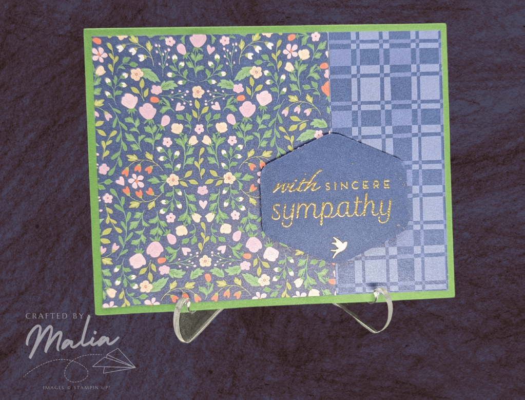
I also got to try my hand at clear embossing. I wanted to blend some color on top after I had embossed to make the ink pop, and and I learned some valuable lessons. First, color theory still counts. Blending blue into yellow makes green, not blue. Also, sometimes you gotta use a lot of layers. I didn’t like how the Easter sentiment was coming out. The blended effect was kind of neat but it really didn’t work with the card, so I blended and blended until I made it almost look like I had stamped the sentiment on Night of Navy. I decided not to push my luck with the yellow cardstock after having messed up the first time. I know I definitely want to experiment more with clear embossing in the future.
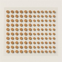
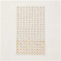
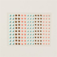
Finally, I slapped some dimensionals on and stuck the sentiments to the cards. They were all delightful, but I eyed the growing collection of embellishments in my drawer, and figured a few gems couldn’t hurt. I don’t ever feel like I am doing embellishments “correctly”, but this was a good opportunity to practice. I also gave myself a break and didn’t embellish all of the cards, and I think they all turned out nicely.


In the end, I now have a set of twelve cute cards for all sorts of occasions. They’re so cute that I’m tempted to make them again, but maybe I’ll just pick two or three of my favorites to make batches of.
I hope these cards are inspiring. They’re proof that great DSP goes a long way toward a cute card. I recommend you get this set and play around with it (it was just added to Sale-A-Bration so it’s free with a purchase of $50!) I’m know it will inspire you to make some cute crafts.
By the way, the dimesions are as follows: a standard 5 1/2″ x 8 1/2″ base, scored at 4 1/4″, and a piece of DSP cut to 5 1/4″ x 4″ and then cut again at 3 1/2″ on the long side (so 4″ x 3 1/2″ and 4 x 1 3/4″).


2 responses to “Delightfully Eclectic Cards”
I loved reading about your process of making these cards!! Glad you stuck with it or they’d still be lying in a pile on your desk. My favorite paper in this set is the pretzels!! Ha! I’m definitely going to use this simple layout. Thanks for the inspiration!
LikeLike
What a great read! It made me smile lots. Besides a great cardmaker, you’re a great writer too!!!
LikeLike